
|
Vol 78 |
Page 9 |
Privacy Policy | Editorial Policy | Profit Policy | Join the Association | List of Members | Contact us | Index | Links
Back Go to page: 1 2 3 4 5 6 7 8 9 10 11 12 13 14 15 16 17 18 19 20 Forward

Allan George's Gems.
Contents:
A hug a day keeps the doctors away.
How much download speed do you really need?
US Navy beams power using microwaves.
What's the difference between "Enter" and "Return?"
What's the difference between HP and BHP?
![]()
How much download speed do you really need?
Your local internet service provider (ISP) likely has a variety of packages ranging from budget options to the fastest speeds available in the region. But how much download speed do you actually need?

To get to the bottom of how much download speed you actually need from your ISP, let’s look at what common internet activities require, how to calculate what your household needs, and the times when having the fastest speed available actually provides some benefit.
How much bandwith common activities require.
It’s interesting to note how frequently a person’s internet plan is mismatched with the internet activities in which they’re actually engaging.
Frequently retired people who use the internet for little more than social media to keep up with family and some light YouTube browsing, are paying for a gigabit fibre connection, yet the family next door, who spent the last two years working from home, was using a slow DSL connection a mere fraction-of-a-fraction the speed of the elderly neighbour’s fibre line. Clearly, the internet packages are mismatched to their users, but how is the average person supposed to know that?
The easiest way to put how much bandwidth, or download speed, you need into perspective is to consider how much bandwidth various common internet activities require and then consider how big a role those activities play in your internet use.
Let’s look at some common activities, ranked from the least demanding to the most demanding.
|
Internet Activity |
Minimum recommended download speed |
|
|
1 Mbps |
|
Music Streaming |
2 Mbps |
|
General Web Browsing |
3 Mbps |
|
Social Media |
5 Mpbs |
|
Online Gaming |
5 Mpbs |
|
Video Conferencing |
5 Mpbs |
|
HD Video Streaming |
5 Mbps |
|
4K Video Streaming |
15 Mbps |
It might come as a surprise to many people, but when you look at individual internet activities, they simply aren’t that demanding. Low bandwidth activities like using email (or any other text-based communication like chatting), streaming music, or just browsing around the web searching for things or reading posts on your favourite forum, just don’t use that much bandwidth.
And what you might think is a high bandwidth activity, like streaming video, isn’t actually particularly high bandwidth in the grand scheme of things. You just don’t need that much download speed to stream video. With a 100 Mpbs connection, you could likely stream 4K video to TVs in every single room in your house, plus all the handheld devices and still have some bandwidth to spare. Further, it’s important to emphasize that more bandwidth doesn’t make a less-demanding bandwidth activity better.
There is an upper threshold to how much bandwidth any given activity is going to use. If you need 5 Mbps of bandwidth to enjoy a smooth and stutter-free HD video stream, having 100 Mbps doesn’t make for an exponentially improved experience. It’s just extra bandwidth you’re not using—but paying for the privilege of keeping on perpetual standby just in case.
Calculating your household’s bandwidth needs.

If you read that bit above about how a 100Mpbs connection could stream 4K to a dozen or more devices in your home without strain, you might have thought “But I don’t need to stream 4K to every single room of my house, that’s silly,” and it is silly. For the vast majority of people, purchasing the highest tier of internet service available to them, especially if that’s 100 Mpbs speeds, is overkill.
Instead, they should look at how their household actually uses the internet and purchase an internet package that aligns with that. For a single person household where the regular internet activities are playing around on Instagram while watching Netflix after work, there really isn’t much need for more than 15-20 Mbps of bandwidth, and that assumes the person is watching 4K content and furiously scrolling through Instagram at the same time. You can adjust that estimate easily by looking at the chart above and guesstimating how often high-demand activities happen simultaneously. Have a larger household where multiple adults or teenagers are all streaming video simultaneously in the evening and, perhaps, gaming at the same time while they binge-watch Netflix? Multiply the number of users in your household by those activities.
Again, you might be surprised to see that the number, even if you believed your household to be pretty internet hungry, is actually fairly low. The reality is that despite the shiny allure of getting 100Mbps internet, most households really only need around 40Mbps of internet bandwidth to meet all their needs.
Even a household full of people living in a more-or-less permanent online state likely won’t need more than 40 Mbps to give everybody a satisfactory experience.
Bandwidth recommendations by streaming providers.
If you’re curious what your preferred streaming provider recommends, you can check below. For consistency, the video quality is indicated by resolution first and then the common name.
|
480p (SD) |
720p (HD) |
1080p (HD) |
2160p (4K) |
|
|
Netflix |
1 Mbps |
3 Mbps |
5 Mbps |
15 Mbps |
|
YouTube |
1.1 Mbps |
2.5 Mbps |
5 Mbps |
20 Mbps |
|
Prime Video |
1 Mbps |
|
5 Mbps |
25 Mbps |
|
Hulu |
1.5 Mbps |
3 Mbps |
6 Mbps |
16 Mbps |
|
Apple TV+ |
|
|
|
25 Mbps |

A sign in Australia to advise that slow drivers are about to temporarily increase their speed.
A hug a day keeps the doctors away!

Scientists have identified which chemicals tell your brain a cuddle feels good.
We humans crave touch from a young age to make us feel better. When a kid scrapes their knee, they turn to their parents for a hug. When they walk to school for the first time, they hold their parent’s hand tight.
Perhaps unsurprisingly, that need for physical contact doesn’t go away when we get older, as scientists from the Washington University School of Medicine know only too well. Researchers from the school have recently identified the chemical messenger that sends the ‘pleasant touch’ sensation from your skin to your brain. Often taking the form of hugs, hand-holding, or caressing, ‘pleasant touch’ delivers for most people a psychological boost that helps reduce their social isolation and stress.
But for people with disorders characterised by physical contact-avoidance and impaired social development, such as autism, those benefits aren’t shared. To better understand and treat these disorders, the US scientists used mice to identify the neural circuit and neuropeptide (a chemical messenger that carries signals between nerve cells) that sends the feel of pleasant touch to your brain.
The neuropeptide has the catchy name prokinecticin 2 (PROK2).
It’s an important discovery, because it suggests that one day scientists may be able to artificially increase pleasant touch signals in people who would otherwise miss out on their health benefits. Now that we know which neuropeptide and receptor transmits only pleasant touch sensations, it may be possible to enhance pleasant touch signals without interfering with other circuits, which is crucial because pleasant touch boosts several hormones in the brain that are essential for social interactions and mental health.
The sensation of pleasant touch is important to all mammals.
Holding the hand of a dying person is a very powerful, comforting force, animals groom each other, people hug and shake hands.
Loss of pleasant touch leads to antisocial behaviour. It was found that mice bred without PROK2 were unable to sense pleasant touch signals but continued to react normally to other physical sensations, such as feeling itchy. They also stopped grooming themselves and showed signs of stress not seen in normal mice. On top of this, the researchers found that mice lacking pleasant touch sensation from birth had more severe stress responses and were less social than mice whose sense of pleasant touch was blocked in adulthood.
These findings emphasised the importance of maternal touch in the development of babies. Mother dogs like to lick their pups, and adult mice also groom each other frequently, for good reasons, such as helping emotional bonding, sleep and stress relief. But mice without PROK2 avoid it. “Even when their cage mates try to groom them, they pull away. They don’t groom other mice either. They are withdrawn and isolated.”
A man and his wife were having some problems at home and were giving each other the silent treatment. Suddenly, the man realized that the next day, he would need his wife to wake him at 5:00 AM for an early morning business flight. Not wanting to be the first to break the silence (and LOSE), he wrote on a piece of paper, ‘Please wake me at 5:00 AM.’ He left it where he knew she would find it. The next morning, the man woke up, only to discover it was 9:00 AM and he had missed his flight. Furious, he was about to go and see why his wife hadn’t wakened him, when he noticed a piece of paper by the bed. The paper said, ‘It is 5:00 AM. Wake up.’
Men are not equipped for these kinds of contests.
US Navy wirelessly beams 1.6 kW of power a kilometre using microwaves.

A microwave dish transmitter is pointed toward a rectifying antenna in part of the Safe and Continuous Power Beaming – Microwave (SCOPE-M) demonstration. In what it describes as the most significant demonstration of its kind in half a century, the US Naval Research Laboratory (NRL) beamed 1.6 kW of power over a kilometre using a microwave beam at the US Army Research Field in Maryland.
The idea of transmitting power over long distances without wires has been around for well over a century. By the 1970s, the technology was mature enough to make it a key component in a concept by American physicist Gerard K. O'Neil that proposed establishing space colonies to build huge solar collector stations to beam power back to Earth.
The principle is simple enough. Electricity is converted to microwaves, which are then focused in a tight beam at a receiver made up of what are called rectenna elements. These are very simple components that consist of an x-band dipole antenna with an RF diode. When microwaves strike the rectenna, the elements generate DC current.
Despite initial doubts, microwave beaming turns out to be surprisingly efficient and the NRL team has been tasked by the US Defence Department with developing the Safe and Continuous Power Beaming – Microwave (SCOPE-M) project to explore the practicality of fielding the technology.
Using a 10-GHz microwave beam, SCOPE-M set up at two locations. The first was the US Army Research Field at Blossom Point, Maryland, and the second was at the Haystack Ultra Wideband Satellite Imaging Radar (HUSIR) transmitter at MIT in Massachusetts. (Rectifying antenna at right).

The frequency was chosen because it was not only able to beam even in heavy rain with a loss of power of under five percent, it's also safe to use under international standards in the presence of birds, animals, and people. This means the system doesn't need the automatic cut-outs developed for earlier laser-based systems. In the Maryland tests, the beam operated at an efficiency of 60 percent. The Massachusetts test didn't reach the same power peak, but had a higher average power level, so more energy was delivered.
The Rectifying antenna was attached to a receiver tower.
The SCOPE-M technology could one day be used to transmit power on Earth or from large orbital solar power stations to provide electricity to the national grids 24 hours a day, 365 days a year. However, a more immediate application that the DOD is interested in is to beam power directly to troops in the field, eliminating the need for vulnerable fuel shipments.
Although SCOPE-M was a terrestrial power beaming link, it was a good proof of concept for a space power beaming link. The main benefit of space to Earth power beaming for the DOD is to mitigate the reliance on the fuel supply for troops, which can be vulnerable to attack.
See this video. https://youtu.be/JGuPaYtcJx8
Last night my neighbour came home drunk and banged on his own front door and rang the bell for at least 10 mins.
Problem is he lives alone so I went outside and told him he wasn’t there. He thanked me and left.
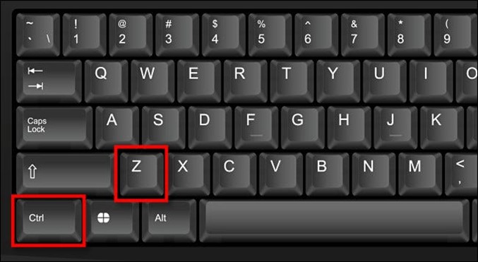
What does the Ctrl+Z keyboard shortcut do?

If you’ve typed the wrong thing, deleted by mistake, or performed another accidental action in Windows, you’ll likely want to use Ctrl+Z at some point. Here’s what it does.
It’s the Undo Shortcut
If you press Ctrl+Z on Windows 10 or Windows 11, you’ll Undo your previous action in most apps. This comes in handy when you make an input mistake or delete some content and you want to quickly fix it. The shortcut also works in File Explorer when renaming files and while performing some other actions.
Often you can also perform an Undo from a menu command in an app, such as Edit > Undo in apps with a traditional menu bar at the top.

The Ctrl+Z Undo shortcut originated in Windows with version 3.1 in 1992, borrowed from the Apple Macintosh (where is it Command+Z instead). The Mac borrowed the Command+Z shortcut from the Apple Lisa (1983), which (along with the cut/copy/paste shortcuts) was created by Larry Tesler as Apple+Z for the Lisa keyboard layout at the time.
Prior to Windows 3.1, early Windows releases supported an alternative Undo shortcut, Alt+Backspace, which is still usable in many Windows apps today, but it might not be universally supported in every app.
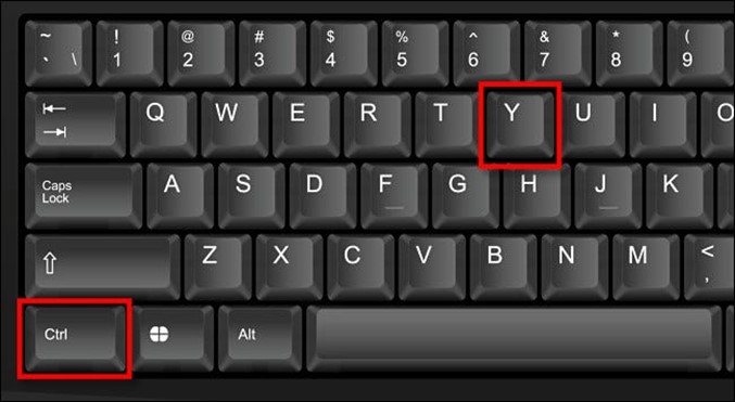
You can Redo, too
After pressing Ctrl+Z to Undo, you can revert to the previous state (before the Undo) in many apps by performing a “Redo.” To do so, press Ctrl+Y, or select “Redo” from a menu.
Good luck, and happy editing!
She said she missed me. Normally that would be good but she’s reloading.
How to make videos look better on a Samsung Galaxy phone’s display.

Samsung phones have some of the best displays you can get. You probably take advantage of these big, beautiful displays by watching videos, so why not make those videos look the best they can? That’s where “Video Enhancer” comes in.
What makes Samsung displays look so nice, anyway? Most Galaxy phones have what Samsung calls “Super AMOLED” displays. Essentially, it’s a special type of OLED display for Samsung devices. It offers very rich, deep blacks and vibrant colours.
To get the most out of your Samsung device’s display, you will use a tool called “Video Enhancer.” Some Galaxy devices simply call it “Video Brightness” and that’s probably a more accurate name.
With Video Enhancer enabled, your device will increase the screen brightness and make colours more vibrant while you watch videos. You don’t have to manually turn up the brightness every time you watch a video. What’s even cooler is you can decide which apps will trigger the Video Enhancer. So, if you only want to use it for YouTube but not Netflix, you can do that. It will simply turn on and do everything for you.
Here's how to set it up.
|
Depending on the model of your phone and how you’ve set it up, either swipe down from the top of the screen once and tap the gear icon or just open SETTINGS.
|
|
|
|
|
|
Scroll all the way down to “Advanced Features.”
|
|
|
|
|
|
Next, find “Video Enhancer” or “Video Brightness.” |
|
|
Then switch over to “Bright” mode. |
 |
|
|
|
|
Under that, you’ll see a list of supported video apps. Toggle on or off any of the apps that you want to use Video Enhancer adjustments. |
|


That’s all there is to it! You’ll notice the screen gets a bit brighter and colours will look a little extra saturated when you’re using the selected apps.

Since I bought this toy for my dog I’ve not been bothered by salesmen, break-ins,
or friends dropping in unannounced. Just peace and quiet.
What’s that white stuff on my chocolate?
If you've ever left chocolate uneaten, especially in the fridge, you'll recognise this white powdery residue.

The words ‘chocolate’ and ‘disappointment’ don’t often go together but you may have experienced some disappointment if you’ve ever unwrapped an Easter egg to discover white, chalky chocolate inside. What is this white substance? Is it mould? Bacteria? Is it bad for you? Can you still eat it?!
The answer is yes, you can! It’s called “bloom” and it’s caused by the fats or sugar in the chocolate. To understand why it forms and how to avoid it forming, you need to consider the chemistry of chocolate.
Chocolate is made up of a relatively small number of ingredients, cacao beans, sugar, milk solids, flavourings, and emulsifiers to keep it all mixed together. Fermenting and roasting cacao beans triggers many chemical reactions that develop delicious flavours. Much in the same way peanut butter can be made from peanuts, the roasted cacao beans are ground into a paste known as cocoa liquor. The liquor is mixed with the other ingredients and ground together with heating (known as conching) to form liquid chocolate.
The fluidity of the cocoa liquor comes from the fats released when the beans are ground. These fat molecules are known as triglycerides and they resemble the letter Y with three long zigzagging arms connected to a central junction. The triglyceride arms can vary, but they tend to be a mixture of saturated and unsaturated fatty acids.
When the melted chocolate cools, these triglyceride fats assemble into highly ordered structures that are crystals at the molecular scale. Depending on how well the temperature is controlled, the fats can take on one of six different crystal structures. These different crystal forms are called polymorphs. The most desirable crystal form gives chocolate a smooth, glossy appearance, a clean snap and a melt-in-your-mouth texture. Achieving this requires careful temperature control from liquid to solid through a process known as ‘tempering’.
Poorly controlled cooling of the melted chocolate results in other crystal forms, which tend to have a less pleasing look and mouth feel, often chalky or gritty. These less-desirable forms can convert during storage and as the underlying crystal structure of the fats change, some of the triglycerides separate. These separated fats collect at the surface as colourless crystals, giving the chocolate a white fat bloom. This is especially noticeable if the chocolate is poorly stored and goes through melting and resolidification.
The ingredients can also affect fat bloom. Cheap chocolate tends to use less cocoa butter and more milk solids, which introduce more saturated fats. Saturated fats are also common in nuts and can migrate from the nut to the chocolate surface. So, a chocolate-covered hazelnut is more likely to show fat bloom than a nut-free version.
Sugar bloom is less common than fat bloom, although they can look very similar. It occurs when sugar crystals separate from the chocolate, particularly under humid storage conditions. You can tell the difference with a simple test. Sugar bloom will dissolve in a little water, while fat bloom will repel water and will melt if you touch it for a while. Unfortunately, chocolate bloom can’t be reversed unless you completely melt the chocolate and recrystallise it at the correct temperature.
The easiest ways to avoid bloom in chocolate is by choosing a brand with a high cocoa butter content, transporting and storing your eggs in a low temperature and humidity and making sure you eat it before their best before date – assuming it lasts that long!
Why was there no Windows 9?
Microsoft jumped between Windows 8 and Windows 10, why there was no Windows 9.
The press assumed the next major version of Windows, after Window 8, would be called “Windows 9” and yet on the 30th September, 2014, Microsoft surprised everyone by announcing “Windows 10” instead. The reason why had a lot to do with the previous major version of Windows, Windows 8.
Windows 8, while innovative, wasn’t well-received. It was generally regarded as an embarrassing flop from Microsoft. Windows 8.1, launched in 2013, fixed some (but not all) of its most unpopular features in recognition that Windows 8 wasn’t an ideal release.
In naming “Windows 10,” the firm wanted to show that Threshold was not just an upgrade or continuation of the unpopular technology found in Windows 8. Windows 10 would be a clean break with a new major version. Also, Microsoft envisioned Threshold as a “wave” of operating systems that would apply to desktops, tablets, Windows Phone, and Xbox One while adapting the UI to each device in an ideal way.
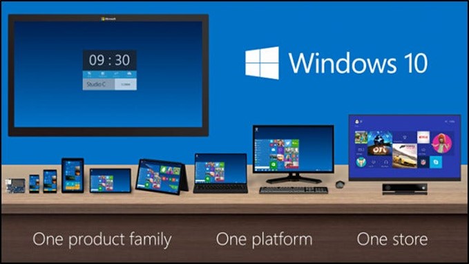
Microsoft emphasized Windows 10 platform unity in this graphic from 2014. Microsoft Interestingly, has had very little to say officially about skipping over Windows 9. During the 2014 Windows 10 launch event (as reported by ExtremeTech since the video is currently unavailable), Windows Chief Terry Myerson gave some important clues about the company’s thinking: “We know, based on the product that’s coming, and just how different our approach will be overall,” he said. “It wouldn’t be right to call it Windows 9.”
Also, Myerson gave another clue that the firm might have wanted to name the release “Windows One,” but was foiled by the existence of Windows 1.0 (way back in 1985). According to ExtremeTech, Myerson mentioned that Windows One would make sense in the context of OneNote, OneDrive, and Xbox One, but “unfortunately Windows 1 has been done by the giants that came before us.”
So if Windows One was taken, we speculate, why not add a zero and call it Windows 10? In the world of marketing, there are no hard logical rules for naming products, so this explanation seems as good as any.
Still, Microsoft’s somewhat vague (“It came and went”) official explanations haven’t satisfied everyone, so alternative theories remain. And here’s a doozy: On the very day of the Windows 10 announcement, someone on Reddit claiming to be a Microsoft developer wrote that Microsoft avoided “Windows 9” because it might confuse programs checking for Windows 95 or Windows 98, two previous Windows releases from the 1990s.
With Microsoft’s famous commitment to backward compatibility—and a proven history with version number check shenanigans—the claim seemed plausible enough to make the rounds on many news sites at the time. Windows fans who are in the know might immediately poke holes in this theory, considering that Windows 95’s official version number wasn’t “Windows 95.” A well-written program doing a version check would actually see a version number of 4.00.95 (and up), and for Windows 98, it would see 4.10.1998 (and up). So the explanation doesn’t seem to hold much water.
But wait: Not all programs are well-written, and people have found evidence of existing legacy code written in Java that checks for Windows version by looking at the string name of the OS instead of the version number. So there may be some truth to the Reddit claim after all. What we don’t know is whether that influenced Microsoft’s naming decision or not, but considering Microsoft’s history of bending over backwards to not break compatibility, it’s very possible.
Also, the number 9 is unlucky in Japan.
While naming Windows 10, it’s possible that someone pointed out that the number 9 is considered unlucky to some in Japan. When pronounced, it sounds similar to the word that means “torture,” although this meaning might not be widespread. Still, considering that “Windows Torture” doesn’t have a great ring to it for the Japanese market, we can understand another reason why Microsoft might have wanted to avoid “Windows 9”—but this is entirely speculative.
Another popular speculation is that Microsoft wanted to bring Windows to version parity with Mac OS X (pronounced “ten”), which stayed in the 10.x version numbers for 20 years. No matter what the reason, if you think about it, hundreds of millions of people use what could have been Windows 9 today—we just call it “Windows 10.” It’s all marketing.
What’s the difference between the “Enter” and “Return” keys?

On a Mac extended keyboard, there’s a “Return” and an “Enter” key. On most PC keyboards, there are two “Enter” keys, but some say “Return” instead. What’s going on here?
The historical difference between Enter and Return
To understand the difference between Return and Enter, we’ll need to go back to their origins. The Return key comes from typewriters. On an electric typewriter (such as the IBM Selectric series), pressing the Return key executes a “carriage return,” which moves the carriage (the roller assembly holding the paper on which you’re typing) back to the start of a line. It also rotates the roller so the paper advances down a line or two at the same time (called a “line feed”). It’s how you begin typing on a new line.
The Enter key originates from early video screen computer terminals, when the need arose to differentiate between adding a carriage return within a form field and submitting the information itself. “Enter” in this case means to send data into the computer after typing a value. Enter also derives somewhat from computer numeric keypads, which come from a lineage of adding machines and data entry devices. In this context, it’s often used as an equivalent to the equal sign (“=”) or Total key on an adding machine, which keeps a running total of values entered.
Mac and PC Do Things Differently
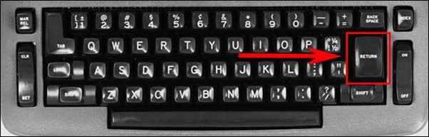
On a standard Windows PC keyboard with a numeric keypad, you’ll find two Enter keys: One just above the right Shift key, and one in the far lower-right corner of the keyboard as part of the numeric keypad. This design emerged on the PC platform with the 101-key “Model M” keyboard back in 1984.
On a Windows PC, both of these keys return the same internal ID code (“13” for Carriage Return), which means that most programs don’t differentiate between them. Internally, however, they return different location codes, which means a properly coded program can tell the difference if it wants to.
Some Microsoft Office apps and a variety of Adobe apps treat the two Enter keys differently depending on context. In general, the Enter in the main section of the keyboard sends a Carriage Return (new line), and the Enter on the numeric keypad is used for submitting data in an entry, similar to clicking an “OK” button. But that can easily change based on the software context.
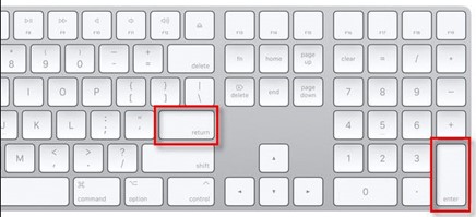
On a Mac, you’ll see a Return key in the main alphanumeric section of the keyboard and an Enter key in the numeric keypad section of extended keyboards. This arrangement first appeared on the Apple Lisa keyboard in 1983 and carried over to the Mac Numeric Keypad in 1984 and the Mac Plus extended keyboard in 1986.
On a Mac, the Return and Enter keys have two different ASCII codes (36 and 76), and as with the PC, many apps consider them the same key, but some apps treat them differently. If your keyboard doesn’t have a numeric keypad, the Return key might also say “Enter” on it. To make your Return key act like Enter, press Fn+Return.
So we’re left with an unsatisfying conclusion. Enter and Return are non-identical twins of each other, each with different functions based on different contexts. They are two different keys and yet they often do the same thing. Ultimately, their value comes from their different locations on the keyboard—although, if you think about it, when has the standard keyboard layout ever really made sense?
Toilet door sign.

HP vs BHP,
You are bound to have stumbled upon the term Horsepower (HP), whether you own a car or not. HP is a measurement which is used during ads for cars and it’s also something that you will often hear being used by those who work in machine shops, or even people who are car enthusiasts, but what about the term Brake Horsepower, (BHP)? What is the difference.

HP was invented by James Watt, horsepower originally measured the amount of work that a horse lifting coal out of a coal mine could do in a minute. Back then, one HP equated to 33,000 foot-pounds. Today, you can easily convert HP into different units, like 1 HP that equates to 746 Watts. It can also be converted into British Thermal Units, or BTU, joules and calories.
However, the most common use of HP, as a unit, is to measure the power of an engine which you can determine by hooking it to a dynamometer. What HP actually measures, is the maximum rate of acceleration and the top speed of the car.
On the other hand, Brake Horsepower measures the HP of an engine without considering the loss in power that is caused by some parts of the engine, like the alternator, power-steering pump, gearbox, water pump and other auxiliary parts. There are actually no other key differences between BHP and HP, other than the fact that when BHP is measured, the engine torque is determined by applying a break to the flywheel as opposed to using a torque converter, like in the case of HP.
To summerize, HP is measured with all the accoutrements attached to the engine, to determine its maximum rate and speed. BHP, on the other hand, is more of a theoretical calculation, which is made under lab-controlled conditions, and without having anything attached to the engine.
Summary:
| 1 | HP is the output horsepower rating of an engine, while BHP is the input brake horsepower of an engine. |
| 2 | BHP is the measurement of an engine’s power without any power losses, while HP is BHP less the power losses. |
| 3 | HP is measured by hooking up the engine to a dynamometer, while BHP is measured in a controlled environment without anything attached to the engine. |

Velly Intelesting - but stoopid!!
Back Go to page: 1 2 3 4 5 6 7 8 9 10 11 12 13 14 15 16 17 18 19 20 Forward